CASE STUDY • DESIGN SYSTEMS • SELF-INITIATED CONCEPT
A content preview system for a streaming platform
Vesper Content Templates is a concept exploring how design and content teams could preview, adjust, and approve partner artwork across devices without leaving their existing workflow. Built from years working inside content production, not studying it from outside.
ROLE
Product Designer
SCOPE
Research → system → validation
FOCUS
Design systems, internal tooling
FORMAT
Self-initiated concept
OVERVIEW
Bringing production realism into the content review workflow
Streaming platforms publish a constant flow of partner-submitted artwork across many device types and regions. Getting that artwork to display correctly, on brand, and consistently is harder than it looks. Content teams need to see how a piece of artwork will actually render before it ships, and they need a shared, repeatable way to review and approve it.
Vesper Content Templates is a concept for a system that lets designers comp and preview artwork directly against accurate device frames, with built-in safe zones, gradient overlays, and brand-compliant UI positioning. It keeps partner-submitted assets aligned with brand guidelines while protecting creative integrity, and it gives regional teams one consistent process for reviewing, adjusting, and approving content.
About this project. Vesper is a fictional platform I created to explore a problem I know firsthand from years inside content production workflows. The research approach, design reasoning, and system are mine. The product, brand, and interface are invented for this concept so I can show the work at full fidelity.
BRAND FOUNDATION
Establishing Vesper before designing for it
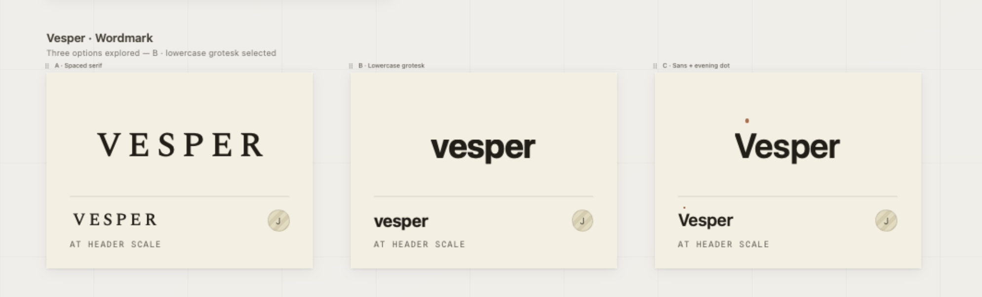
Before building the template system, I defined the brand it had to serve. A content tool only works if it protects a real visual identity, so I established Vesper's voice, palette, and wordmark first, then designed every template around keeping that identity intact. The brand voice is built around mood and time of day: Made for the hour you're in.
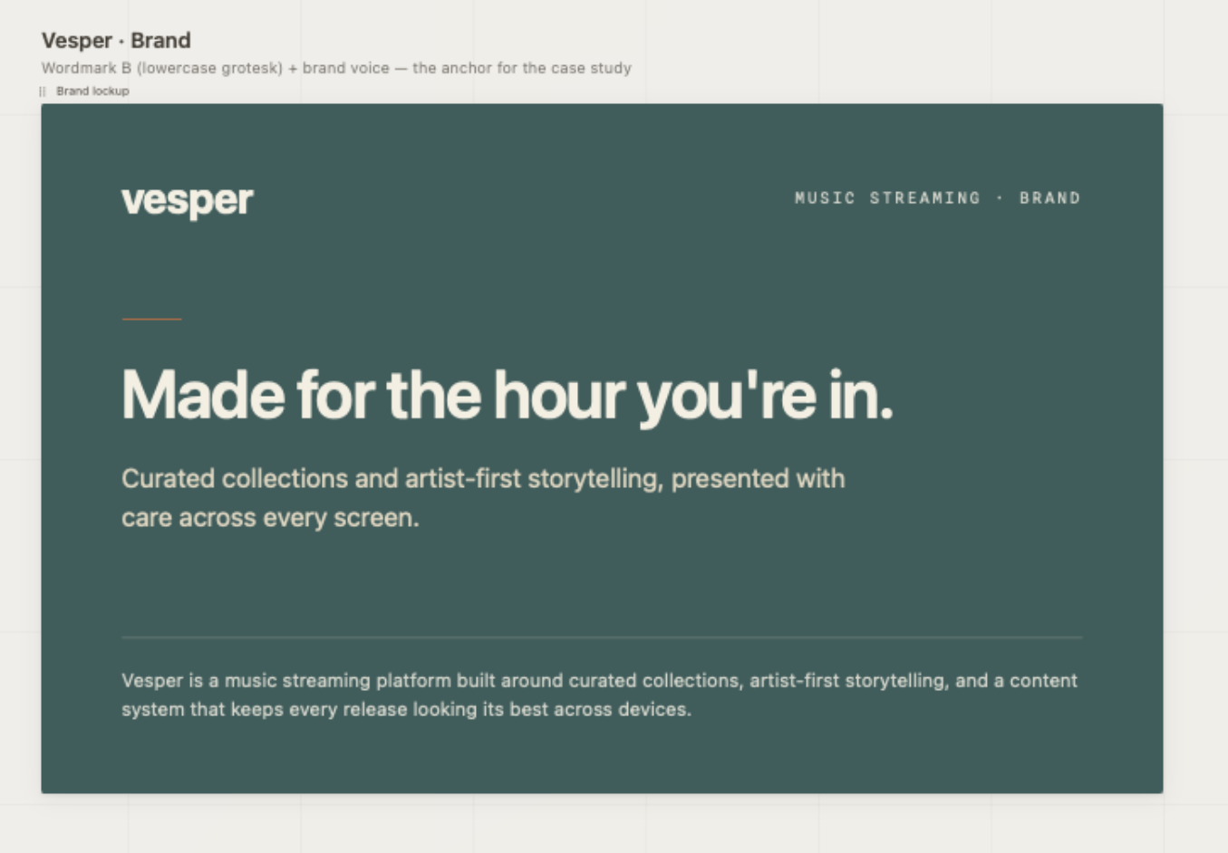
Vesper is a music streaming platform built around curated collections, artist-first storytelling, and a content system that keeps every release looking its best across devices. That last part is the subject of this case study.
RESEARCH
Finding the gap in the workflow
I interviewed designers across three regional teams to map how content artwork actually moved from submission to approval. The pattern was consistent: designers were spending three to four hours per project manually adjusting artwork without accurate device previews, which led to inconsistent quality and repeated rounds of stakeholder revisions.
I ran a competitive analysis of the prototyping tools teams already reached for, including Sketch, Figma, Adobe XD, Flinto, and Proto.io. They were strong at interaction design, but none gave accurate device rendering for motion content, and none fit cleanly into a master art file workflow.
That pointed to a clear need: a solution that worked inside the existing toolset, delivered device-specific previews with no additional training, and held brand consistency while still supporting fast creative iteration.
DESIGN PROCESS
A three-phase solution
-
Starting with low-fidelity wireframes, I mapped safe zones, UI overlay areas, and crop regions for each device type, establishing a modular grid system that could hold a range of content formats.
-
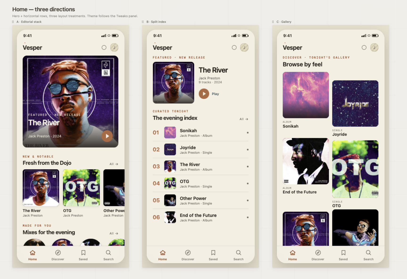
I built adjustable templates for each device type that integrated with master art files, complete with accurate device chrome, gradient overlays, and brand-compliant UI positioning. I chose a familiar, low-friction tool over specialized prototyping software to keep the learning curve near zero and stay compatible with existing workflows.
-
Through real-device testing and pilot validation with designers, I refined the templates across three review cycles, prioritizing pixel-perfect device rendering over interactivity, since creative leads needed to approve visual accuracy rather than interaction patterns.
ARTIFACTS
Low-fidelity wireframes
Foundational wireframes establishing the template structure and content hierarchy, with four zones defined up front so every later template inherited the same rules.
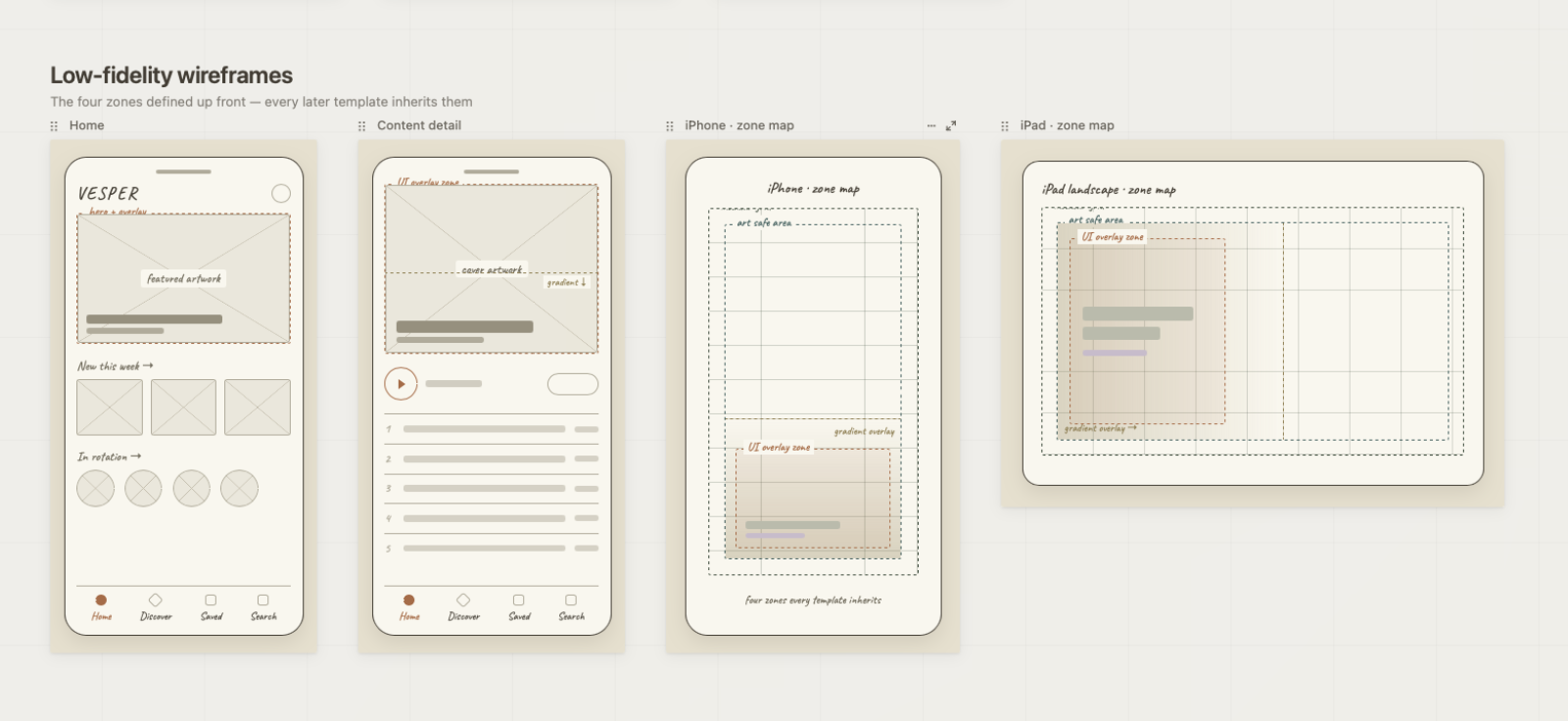
UI overlay zone
Reserves space for titles, metadata, and navigation without interfering with artwork.
Art safe area
Brand-compliant boundaries ensure partner content displays correctly across all devices.
Modular grid
Accommodates various aspect ratios for flexible content types.
ARTIFACTS
Mid-fidelity templates
Production-ready templates with accurate device rendering and brand guidelines built in. This is the core of the system: drop in a master art file and instantly see it in context.
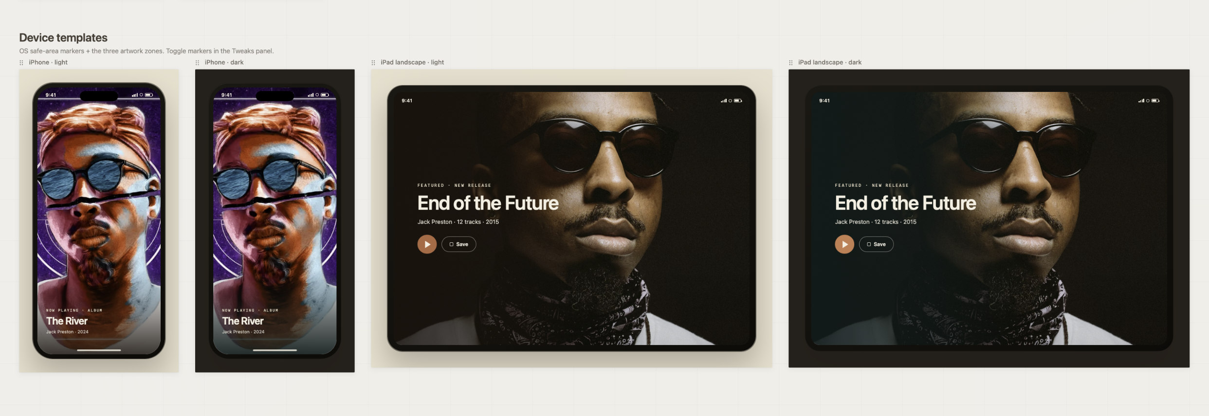
Device-specific chrome
Pixel-perfect frames for realistic stakeholder previews.
Built-in safe areas
Visual guides ensure artwork meets brand standards before approval.
Master art integration
Designers drag and drop files directly into templates, with no manual adjustment needed.
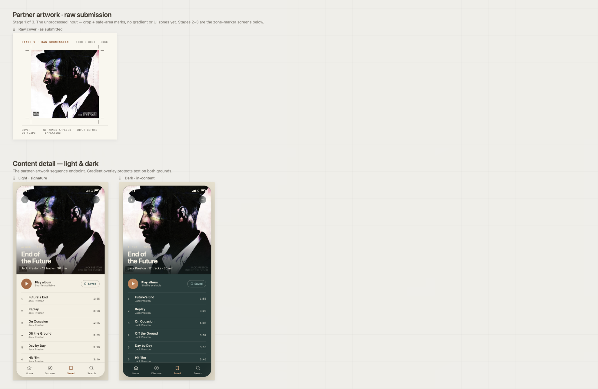
ARTIFACTS
Partner artwork pipeline
From partner submission to production, ensuring brand compliance at every stage. This sequence shows how a raw asset becomes a production-ready preview.
THE SOLUTION
Production-ready previews, built into the workflow
The template system gives designers production-ready visualization without adding a new tool to learn. Designers import their master art files into device-specific templates and instantly preview how content appears across each device type, with accurate UI overlays, gradients, and brand-compliant safe zones.
This removes the manual mockup work that was eating three to four hours per project, and it gives stakeholders realistic previews during creative reviews. The system is designed to become a shared, standardized workflow across regional review teams, so a piece of content moves through the same trusted process no matter where it originates.
INTENDED IMPACT
Designed to accelerate review and reduce revisions
In pilot testing across three review cycles, the templates reduced manual adjustment time and cut down the revision back-and-forth between designers and creative leads. The system was designed to standardize content review across regional teams and raise the baseline accuracy of work presented to stakeholders.
3–4 hrs
of manual adjustment per project the system was designed to eliminate
3 cycles
of pilot validation with designers refining the templates
1 process
consistent review workflow intended across regional teams
REFLECTION
What this project taught me
Effective design tools have to balance flexibility with constraint. The hardest part was making templates rigid enough to guarantee brand compliance, yet flexible enough to hold genuinely different content types.
Adoption lives or dies on the learning curve. Choosing a familiar tool over specialized software meant designers could start immediately, and that decision mattered more to real-world use than any single feature.
And working across multiple review cycles reinforced something I keep relearning: the strongest solutions come from iterative collaboration, not isolated design work. Sitting inside the workflow, not just studying it, is what made the system fit.