CASE STUDY · AI FOR UX/UI AI-ASSISTED
CareGuide AI — a healthcare assistant you can audit.
A trust-centered AI health companion designed around a single hard question: when an assistant gives you medical guidance, how do you know what to believe? The project answers it by making provenance visible — every claim flagged as verified, AI-generated, or contested.
ROLE
Research, UX, Visual System
SCOPE
One Semester
COURSE
AI for UX/UI Designers
TOOLS
Figma Make · Claude Design
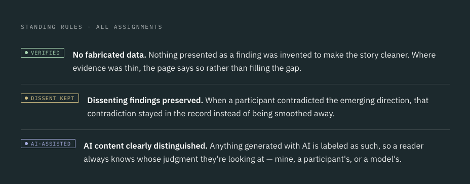
The integrity charter
Before any research began, I set three rules that governed every assignment. They aren't a disclaimer at the bottom of the page — they're the design system. Every artifact in this case study carries the same flags you see here.
Framing trust by auditing the field
Assignment 1 established the research framework and a master repository with integrity flags built in. To define what a trustworthy health assistant should feel like, I audited three products people already turn to — each strong in one dimension, each revealing a gap.
Symptom checker
Ada Health
Structured, clinically grounded triage — but the reasoning behind a result stays mostly hidden from the person reading it.
Gap: confidence without visible provenance.
General assistant
Claude.ai
Fluent, context-aware, genuinely helpful conversation — but no native separation between what's established medicine and what's a generated guess.
Gap: no built-in claim provenance.
Patient portal
MyChart
Authoritative records tied to real providers — but cold, dense, and hard to act on without a clinician translating it.
Gap: trustworthy but not legible.
What real people told me
Assignment 2 moved from desk research to real human interviews. Findings are flagged by what they are — a consistent signal, or a dissent I chose to keep on the record rather than average away.
CONSISTENT SIGNAL
"I don't want it to sound sure. I want it to show me why it thinks that."
Participants trusted hedged, sourced answers over confident ones. Certainty without reasoning read as a red flag, not reassurance.
DISSENT · KEPT
One participant wanted the opposite: less nuance, a faster yes/no, because hedging felt like the tool dodging responsibility. This contradicts the dominant finding, and it stays in the record — it points to a real tension between transparency and decisiveness.
CONSISTENT SIGNAL
Across interviews, the moment of lowest trust was the handoff: when to stop reading and call a real clinician. People wanted the assistant to name that line, not blur it.
METHOD NOTE
Interviews were conducted with family members as participants. That closeness is a known limitation — it risks rapport bias — so it's named here rather than hidden, consistent with the no-fabrication rule. Findings are framed as directional signal for a course project, not validated population claims.
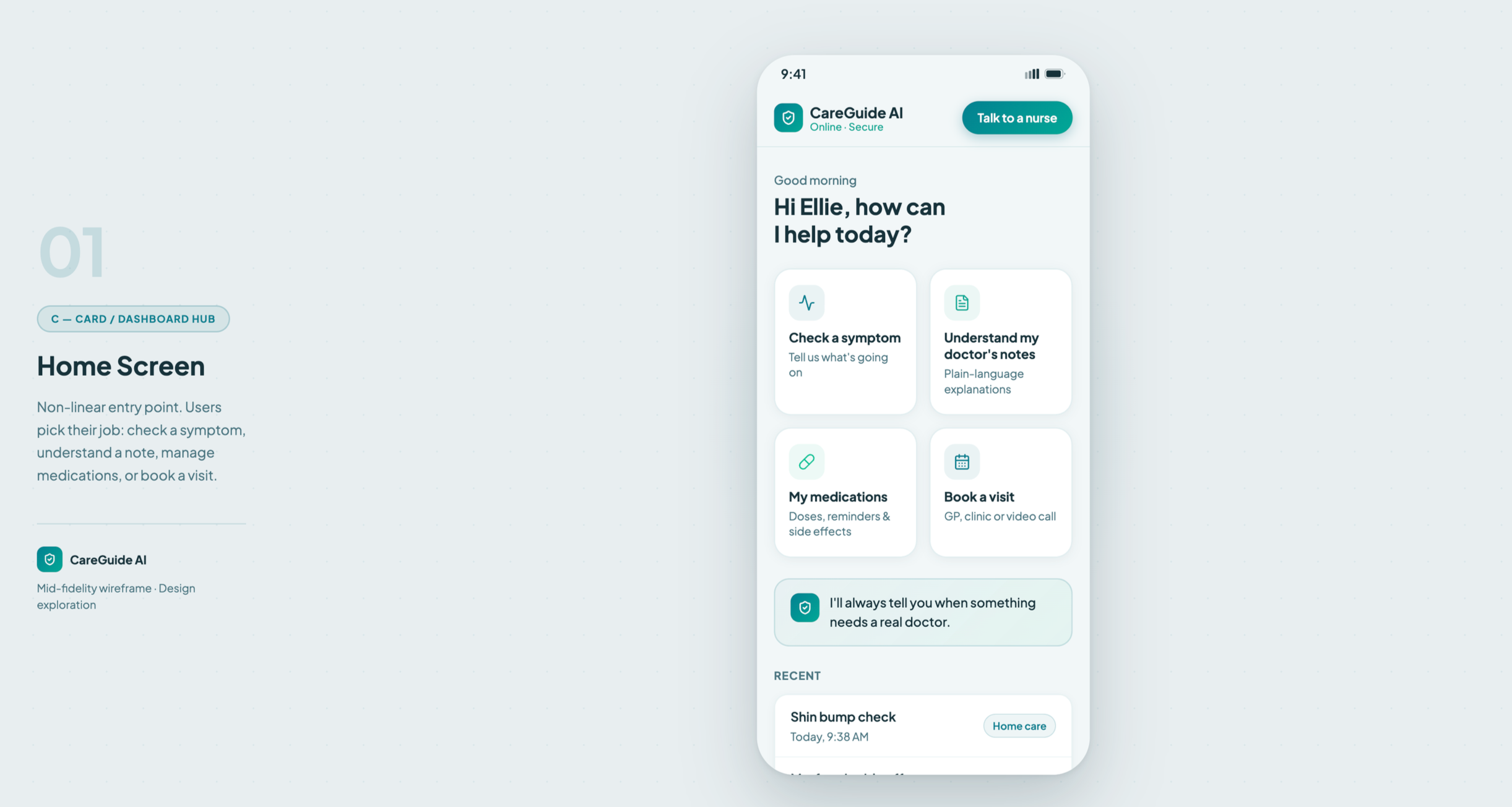
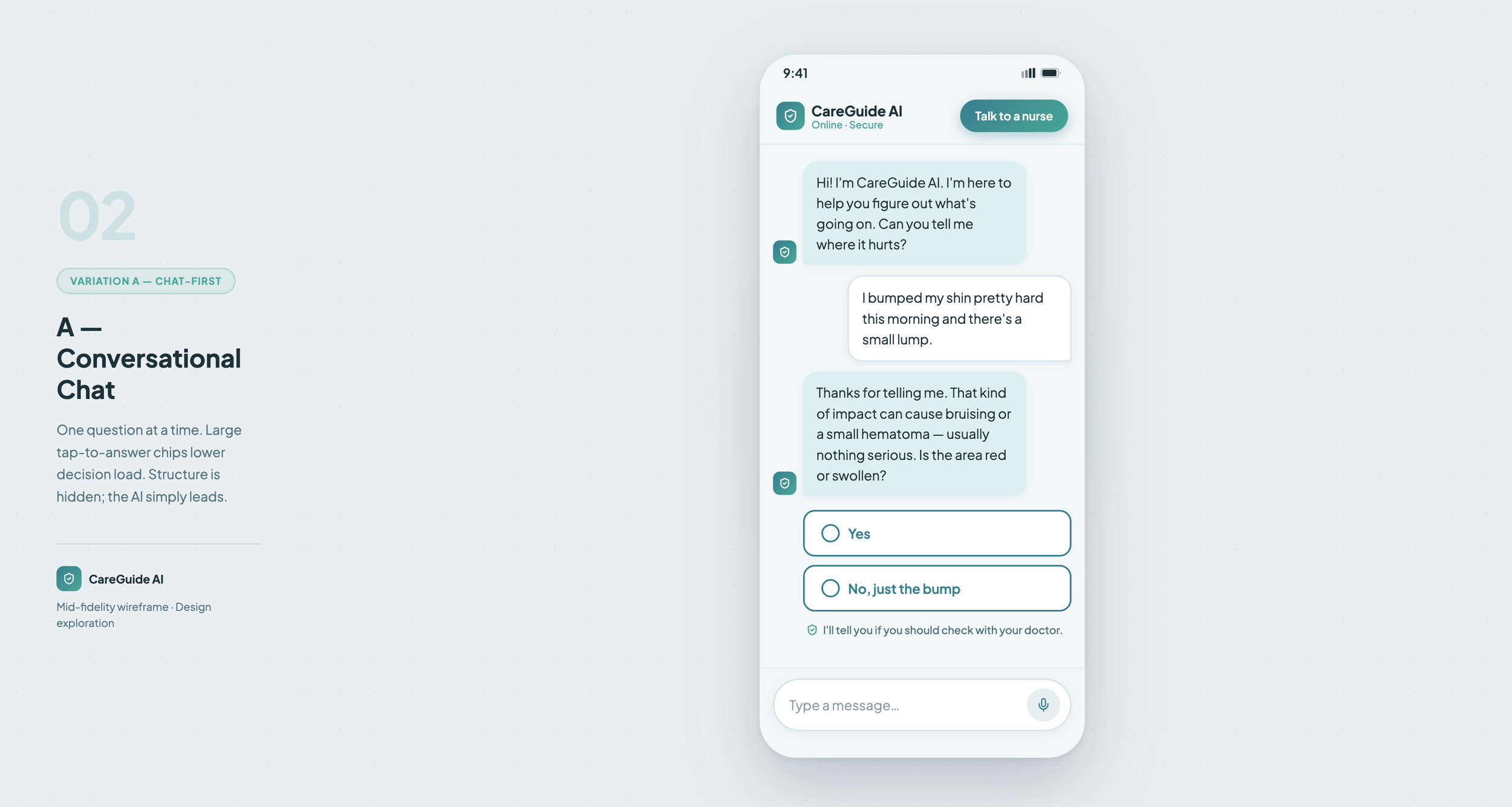
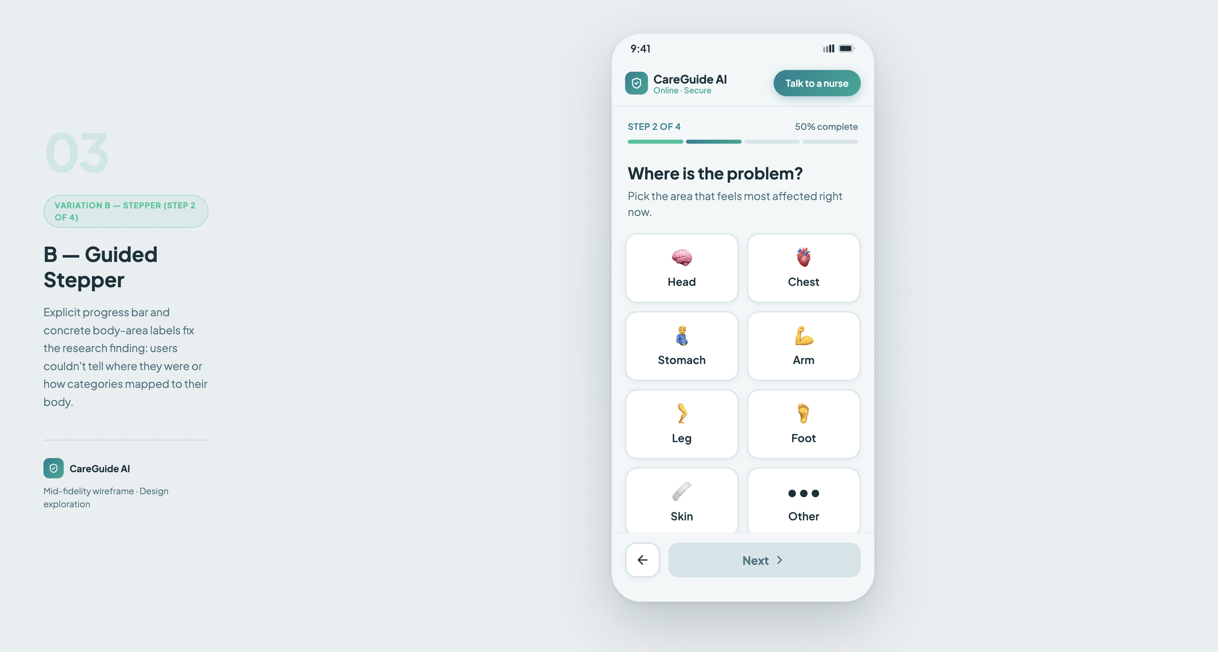
Wireframes: provenance, on the surface
Assignment 3 translated the findings into Figma Make wireframes. The core design move is that every answer carries its provenance inline — the flag system from the charter becomes a live UI element, not an afterthought.
The visual system
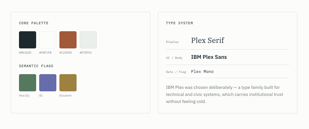
Assignment 4 produced a style guide deck, exported from Claude Design. The palette is clinical-but-warm: a teal ink that reads as calm and credible, with a small set of semantic flag colors carrying the integrity language straight into the UI.
ON THIS CASE STUDY
CareGuide AI was built for the AI for UX/UI Designers course. The integrity flags throughout this page aren't decoration — they're the same standard the work was held to: no fabricated data, dissent preserved, AI clearly labeled. The provenance you can see here is the product thesis, applied to its own write-up.